5 Tips For Designing Effective Print Materials
In today's visually driven world, designing print materials has become an essential skill, breathing life into marketing, education, and artistic expression. From the historical onset of Gutenberg's press to modern digital innovations, print design has evolved, offering numerous creative possibilities.
In this article, you will find five unique tips that reflect the latest trends and techniques in print design, paving the way to create impactful and memorable print materials. Whether a seasoned designer or a curious beginner, these insights promise to invigorate your next print project.
1. Understanding The Target Audience
A foundational step in designing effective print materials lies in understanding the target audience. Accurate research and analysis are imperative, identifying the needs, preferences, and expectations of the readers. This involves delving into demographic factors such as age, gender, occupation, and interests.
When it comes to tailoring design, nuances matter. A design that resonates with a younger audience might fall flat with an older demographic. Utilize visual cues, color psychology, and culturally relevant imagery to create connections. For corporate audiences, opt for professionalism and precision; for artistic circles, explore creativity and flair.
A profound understanding of the target audience ensures that your design speaks directly to the reader. Tailoring your approach to different demographic groups elevates your print material from being merely attractive to genuinely engaging and impactful.
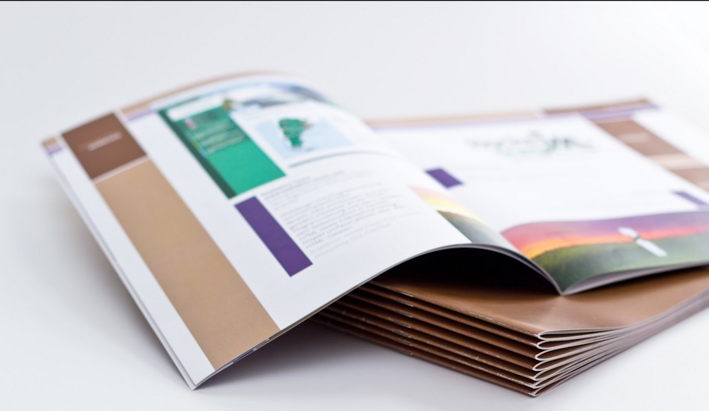
2. Selection Of The Right Paper And Material
One cannot overlook the influence of paper type and texture in designing effective print materials. The choice can affect not only the appearance but also the feel of the final product. If you're looking for a rich texture that conveys quality, consider options like First Colour Printing, known for delivering top quality.
For instance, glossy paper might be suitable for vibrant photographs, while a matte finish could enhance a professional report. Thicker paper conveys durability, making it ideal for business cards or invitations. The guidance here is to always connect the material with the message you want to convey.
Remember, the right selection of paper and material is not merely an aesthetic choice; it's a strategic decision that can elevate the impact of your print design. Choose wisely, understanding your audience's expectations and the goal of your print material, to create a tangible connection with the reader.
3. Use Of Visual Hierarchy
Visual hierarchy plays a pivotal role in orchestrating how readers interact with print materials. It serves as a guide, leading the reader's eyes through the content in an intentional manner. This ordered visual arrangement is not merely about aesthetics; it's a functional tool that ensures that the primary message stands out.
To establish an effective visual hierarchy, one must carefully consider the size, color, position, and contrast of various elements. Larger text or bolder colors naturally draw attention, making them suitable for headlines or key messages. Conversely, smaller fonts or subtler colors can be used for supporting details.
But visual hierarchy goes beyond just size and color. The arrangement and spacing of elements on the page can create a natural flow, encouraging the reader to move from one part to another seamlessly. By prioritizing elements in a design, you build a path that intuitively leads the reader through the content.
In practice, start with identifying the most crucial information. Emphasize this through size, positioning, or other visual cues. Then, layer additional elements, paying attention to how they relate to one another. Balance is key; the overall design must feel harmonious without losing the emphasis on essential parts.
4. Color Management And Alignment
In print design, color management goes beyond merely choosing the right hues. It involves understanding how specific colors interact and the emotions they evoke, taking into account factors such as paper type and ink quality, which can alter appearances.
Alignment, on the other hand, focuses on the positioning of text, images, and other elements. It's about creating harmonious relationships between components, using grids, margins, and consistent spacing. This careful alignment leads to a visually cohesive look, guiding the reader's eyes in a natural flow.
Together, color and alignment are pivotal in print design. Proper color selection, paired with meticulous alignment, creates a balanced and visually appealing piece, enhancing the effectiveness of the printed material.
5. Innovative Typography Techniques
Typography is a cornerstone of print design, and innovation in this field is ever-evolving. This section explores new and trendy methods of typography, offering valuable insights into pairing fonts and using type to convey emotion.
Kinetic Typography: This method introduces motion to text in print, creating effects through gradients or patterns. It makes the words appear to move, providing a unique visual appeal.
Variable Fonts: As a modern innovation, variable fonts allow transitions between different widths and weights. This capability provides designers with options for customization to fit the content precisely.
Pairing Fonts: Combining different fonts requires an understanding of contrast and cohesion. For instance, a bold serif headline might harmonize with light sans-serif body text, resulting in visual balance.
Typography And Emotion: The selection of fonts can express emotions, and choosing the right typeface to mirror the content's mood becomes essential. Script fonts for elegance or bold fonts for robust messages are examples.
Creative Layouts: Unconventional layouts and alignments, such as diagonal or circular text, break from the ordinary, adding surprise and visual intrigue.
The world of typography in print design offers vast opportunities for innovation. Awareness of trends and their thoughtful application contributes to designs that are both visually captivating and emotionally resonant.
Conclusion
Designing effective print materials is a multifaceted process that requires a keen eye for detail and creativity. By embracing these practices, designers like you can create print materials that resonate with the target audience, communicate clearly, and leave a lasting impression.