
When It’s Not a Good Idea to Use the Hamburger Nav Button
- Written by: NewsServices.com
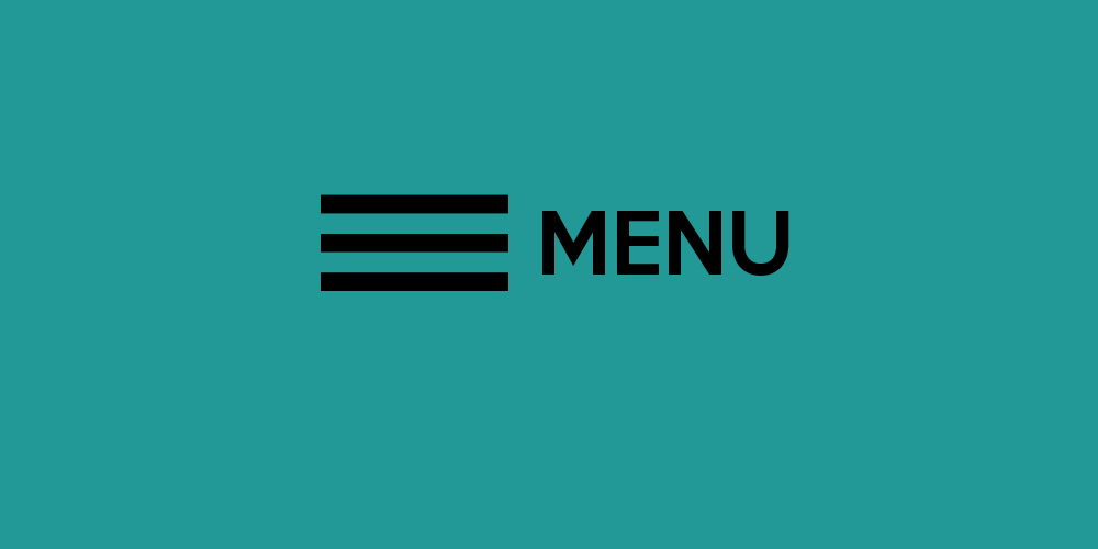
When browsing through websites such as YouTube, I’m sure you might have come across a triple bar icon, usually located on the top right or left top corner of a web page. This is called a hamburger navigation icon. It is often used to store all the navigation options. Hamburger menu can also be referred to as a side menu or a navigation drawer, this is because it hides most of the navigation features and will open only when clicked on.
The hamburger buttons are generally used on mobile websites, applications, and websites that have responsive designs. Also, you can find the hamburger menu icon on desktop websites.
However, having a hamburger icon as the only navigation source on a desktop website can be frustrating, confusing, and, most times, defile unwritten navigation rules, and user flows best practices.
Although the hamburger icon can be a fantastic complement to website navigation, it shouldn’t be the only option for desktops. If so, you’ll be doing the website design a great disservice. And this article will explain why.
Here are some reasons you should avoid the hamburger menu on a desktop.
1) Miscommunication and Misunderstanding
Navigation menus are an entrance to your website; it informs visitors about what to expect, how to communicate, and what the site is about.
However, with hamburger icons having several looks, ranging from the number of lines, color, size, and shape or placement, users can sometimes get confused about how to use them effectively.
The menu items should include links only to essential information on your website. It is advisable to stick to four to six menu items; outside of this might not be helpful to users in deciding on what link to choose.
2) It can be frustrating for users
Depending on your website type, users often expect menu options; if not seen, it can lead to serious frustration, eventually making them leave the site.
The menus hidden inside the hamburger icons have lower overall engagement rate than those right out in the open.
This frustration is often very obvious with users who move around the site and will eventually return to the main navigation menus to get back to specific content, find a blog, or help search for something. This can indicate frustration or inability to find the menu at all.
3) Extra Clicks are Inefficient
Most users expect everything to take as few clicks and steps as possible; adding a few extra steps into the navigation process can make users lose interest as they are unwilling to put in the effort. Putting menu items behind an icon adds an extra click to any user journey involving navigation, and most users tend to shy away from that.
Conclusion
Generally, designers have come to terms with the hamburger menu, and many users understand its use and purposefulness.
However, that doesn’t mean they are perfect regarding navigation. Even though some elements are ok when placed behind a menu, this may not work for certain websites, or user groups, especially on desktop devices.
If you must use a hamburger icon on a desktop, only consider it for a secondary menu or with labels to ensure that the users know what those three lines are meant for.
Creating a compelling user interface for both mobile and desktop users is essential. Get a design that maximises your success on all platforms, by enlisting the services of a Gold Coast web design company that specialises in Gold Coast WordPress development.